CIMB Classics
UI • 2013
CIMB Classic is the only official PGA TOUR FedExCup event in Southeast Asia. In 2013, they opened up for design pitches of the event's main website.
The event's website is a major touchpoint amongst many others in the client's above-the-fold campaign. In this project, I worked with the awesome designer-mentor, Izwan Ismail, to develop the core principle and art direction of our pitch.
Objective
To understand more about what we wanted to achieve, we looked into the client's brief, and researched into how they've built their past sites. From this, we concluded that the site had two purposes:
- Being the primary source of news for the event, and
- Enabling online ticket purchases
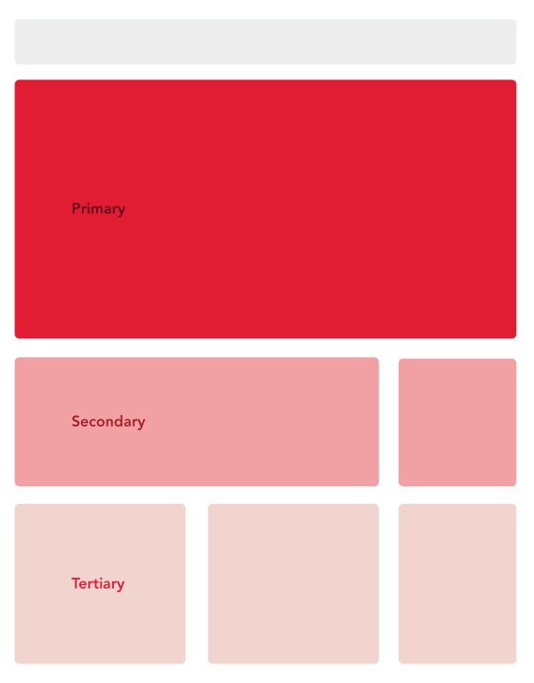
We used size and position to emphasise certain content, and recede others.

80% of the page's real-estate is reserved for content.
Content first
Since we concluded that this site would be the primary source of news for the event, we really wanted to focus the spotlight on the actual content. So we broke down the page into 3 weight group — primary, secondary, and tertiary. This way, big, important news gets surfaced above-the-fold, while more frequent real-time updates (pulled from the organiser's Twitter account) sits just below.
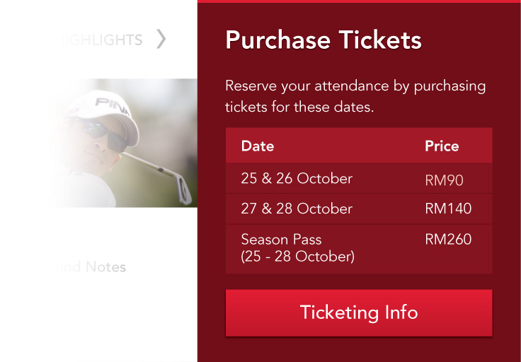
We also understood the business objective of selling tickets for the event, so we reserved a dedicated section on the right column for ticketing information.
Bold colours were used to set this section apart. Showing both pricing and event details up-front allowed for easy comparison for the more deal-conscious visitors.
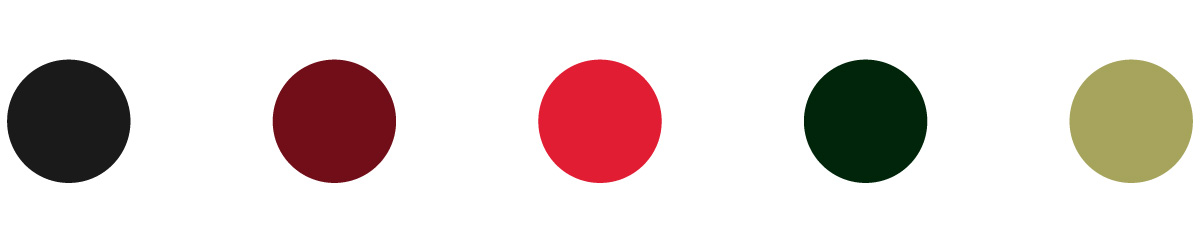
A palette that blends the organiser's and main sponsor's brand colours.
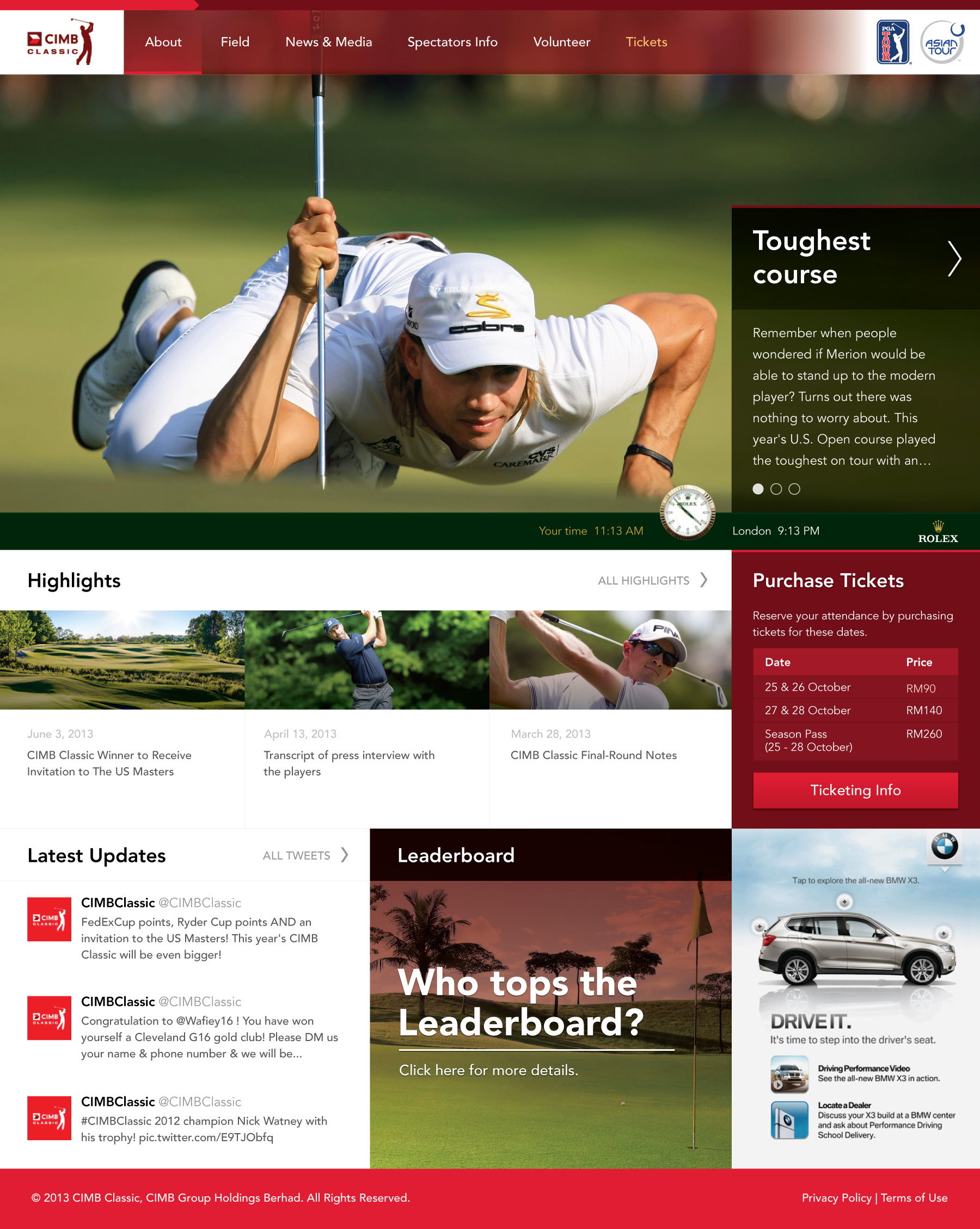
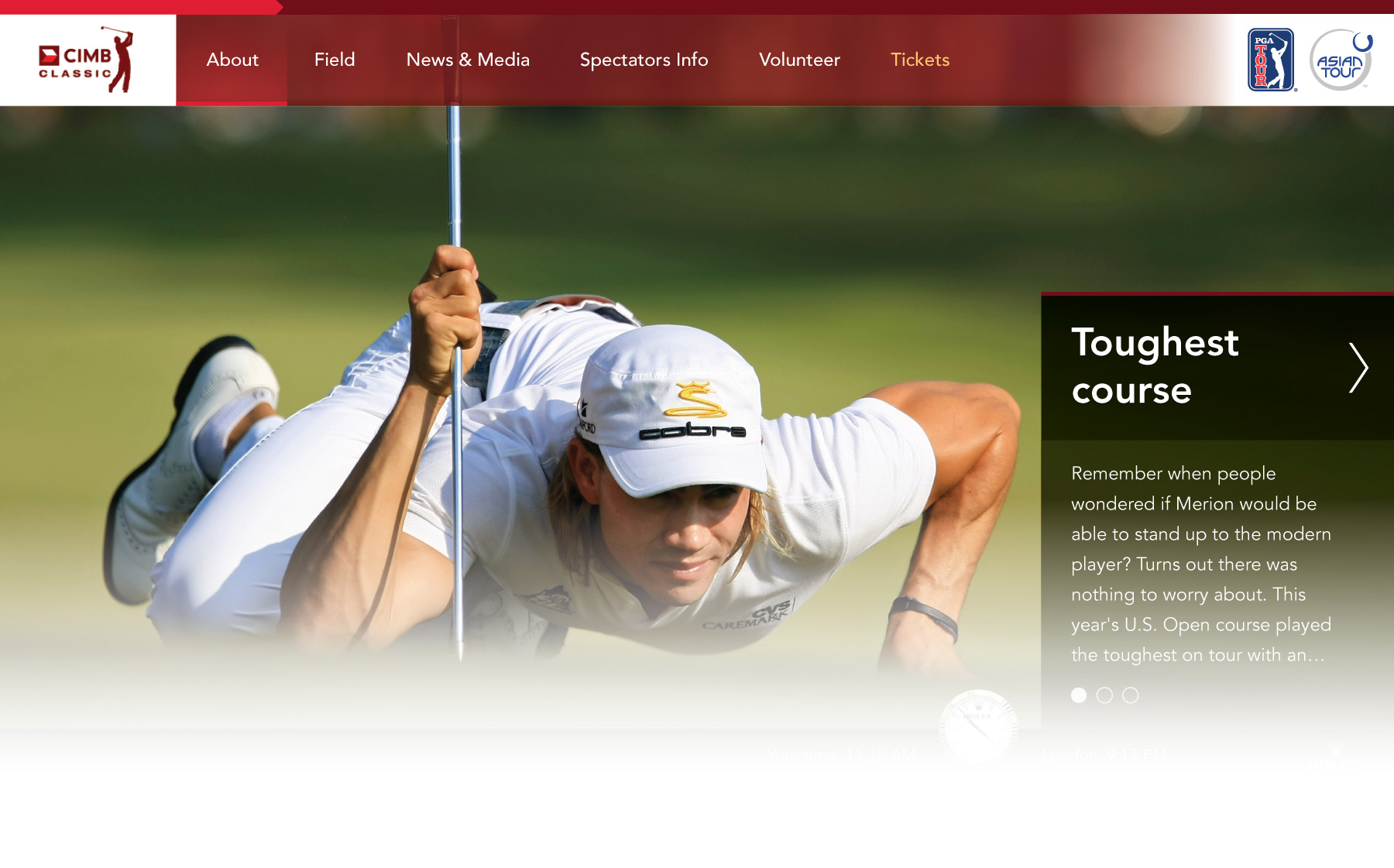
The front page with a prominent highlight of the main event. Green, grassy images was heavily used to seamlessly blend the organiser's colour with the main sponsor's.
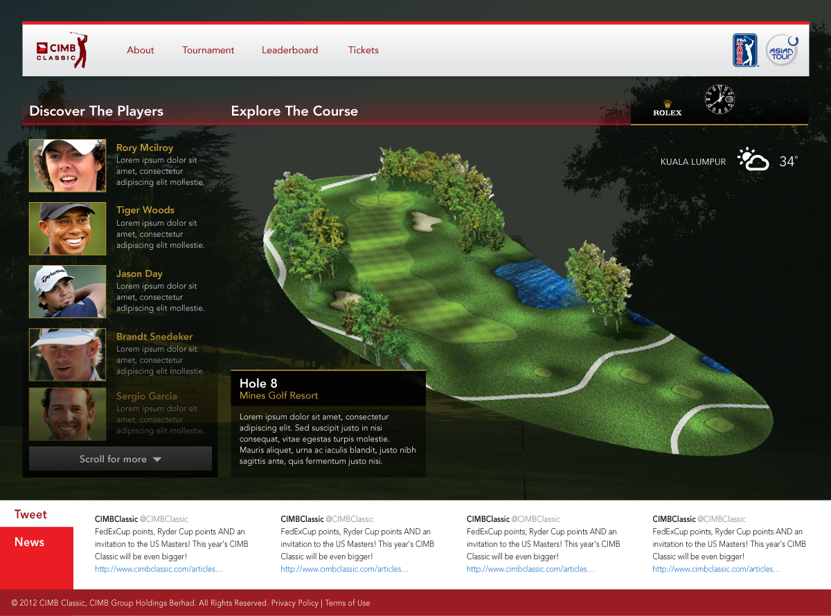
We also proposed a more interactive approach, showcasing more tailored contents to drive engagements.
Two final proposals
We ended up proposing 2 different designs; one that was more "traditional", friendlier for different screens, and can accommodate a variation of contents and ads, and another that is more interactive, intended to bring the audience closer to the game.
We lost the pitch ultimately, but had a lot of fun busting our asses off to get the design ready in time.