The Co.
Identity, UI • 2014
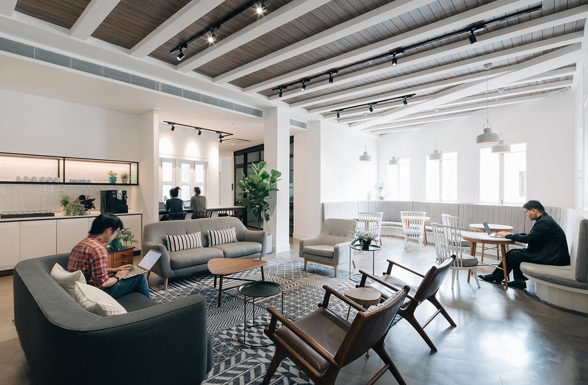
One of The Co's co-working space in Duxton, Singapore. Image from The Co.
The Co. is one of South East Asia’s fastest growing entrepreneurial communities. They run a network of co-working spaces in Singapore and Malaysia.
Originally from Singapore, The Co. partnered with VLT Labs to expand into the Malaysian market. VLT Labs was thus given the opportunity to explore evolving The Co's identity amidst the expansion plan. In this project, I drove the envisioning of the new identity and website design to support The Co's expanding portfolio. Although the project didn't pan out, the rebranding exercise was valuable for me as a designer, and gave me the opportunity to refine my identity and visual design skills.
Objective
In the original brief, The Co. described themselves as 'Community, Concept, Collaboration, Convivial', with an openness to let the community drive their identity. This flexibility whilst core to their identity, introduces a risk of the brand fading as they grow and build bigger, more diverse communities around them.
As they expand their portfolio, there is a stronger need to consolidate and unify them under a single consistent brand experience while embracing the uniqueness of the individual spaces. This also presents an opportunity for the site to become a central hub for the communities around them.
The Co's original identity
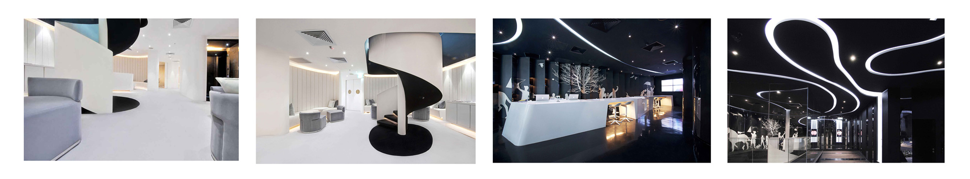
The Co's first space looks ultra-modern and sleek with its black and white theme.
Parking the brand
As an exercise, I wanted to see where the exploration might go if I had moved away from the aesthetic of The Co's existing identity and let the core principle of 'openness and friendlines' inform the design.
The outcome was two identities that introduced a new sense of friendliness through colours.
Early identity exploration
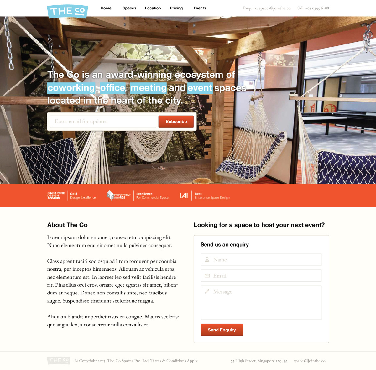
Testing the identity on a mock website design.
This design was shared with the team in KL, and our stakeholders in Singapore during our catchup. We agreed that the new identity felt more friendly, but we also felt that it had lost the 'neutrality' of the old identity that made them feel more 'open'.
Stepping back
Taking the stakeholders' feedback, I scrutinised the existing identity to understand what worked and didn't work. The heavy typography, and lack of colours specifically restricted how the brand communicates its personality, and even less room for embracing the personality of its communities.
So I continued to develop the design by making smaller tweaks — introducing a small visual component, adding new colours and applications, and changing to a more open typography. As a result, the new identity feels more friendly while staying true to the original identity.
Development of the new identity
Laying the foundation
With the new identity set in place, I moved on to work on the website refresh. I worked with our remote stakeholders to identify our two primary personas — remote workers looking for a workspace, and existing customers. This informed the direction of the site as a place where our personas can explore the spaces and the events around them.
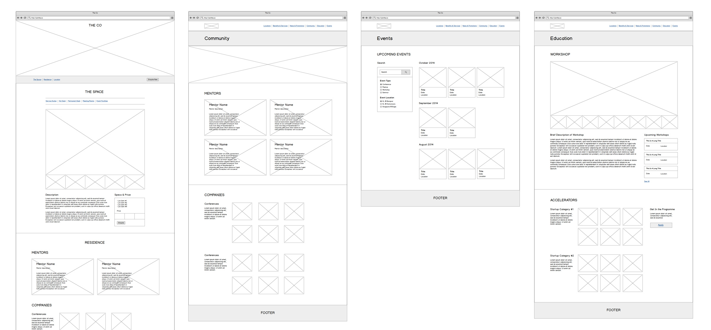
The final key pages and contents were finalised in the wireframe
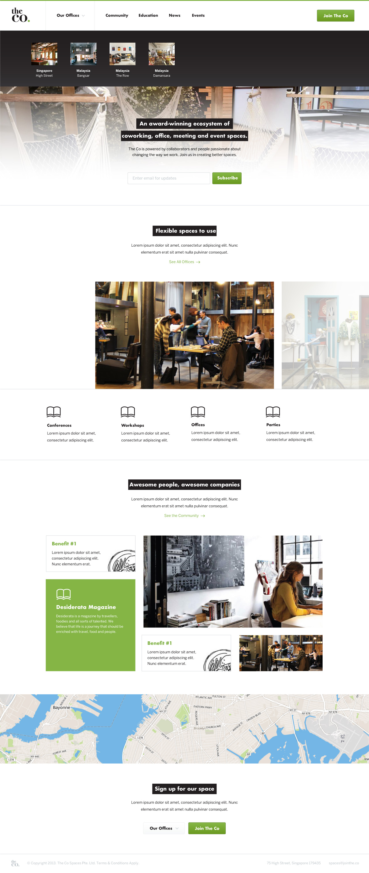
Armed with Balsamiq, we worked through cheap and dirty wireframe mockups and were able to finalise the key pages and contents relatively shortly. The rest was a matter of applying the new brand, building up a simple visual guide and applying them across the site.
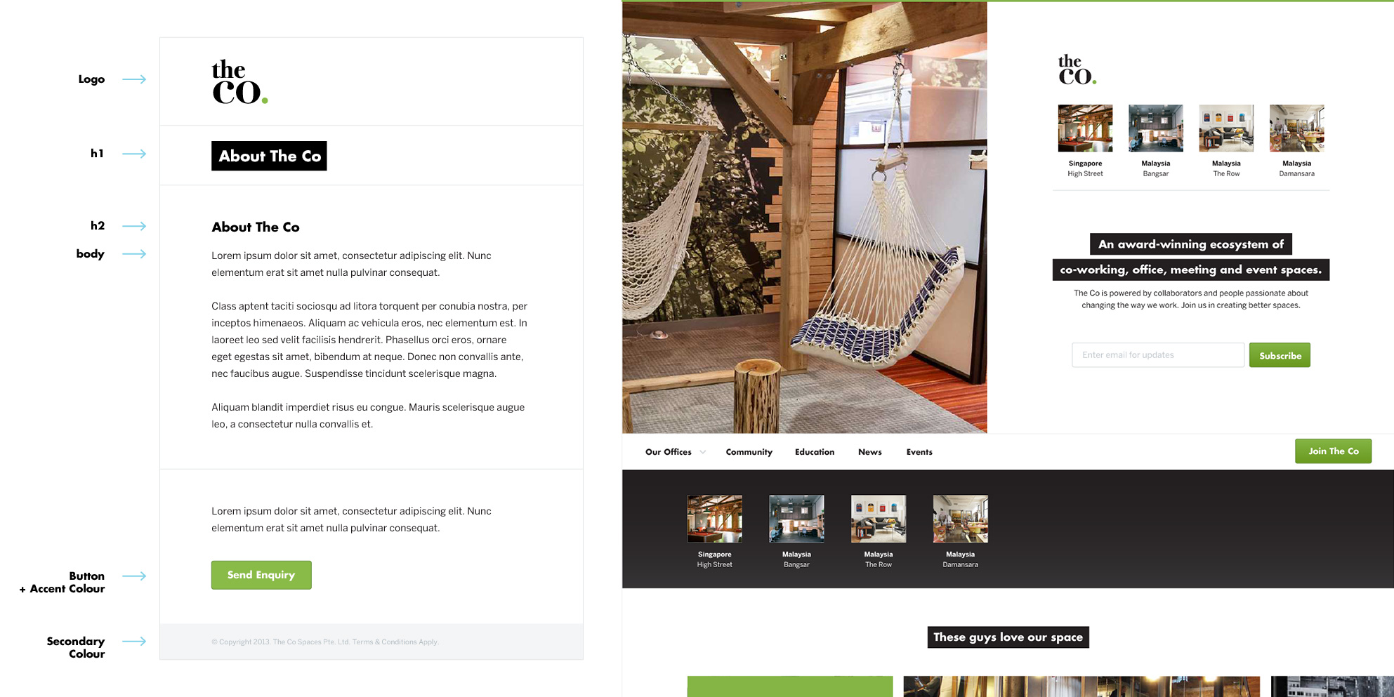
Left: The visual design guide; Right: The visual design applied.
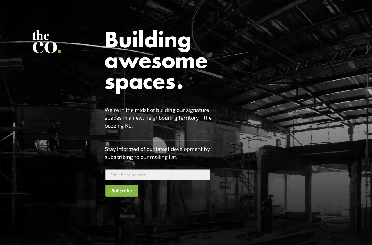
The pre-launch page while the site is in development, simultaneous with the KL space in the background ;)
Even though the project was ultimately parked, I enjoyed the rebranding exercise, and made full use of the creative freedom to design an identity that stayed true to the original design while setting a foundation for future expansion.